
Atlas
Project Specs
Role: UX Research, UX Design, UI Design, Branding
Project Timeline: 9 weeks
Constraints: iOS, HIPAA regulations, integration of existing geolocation software, access to users
Context
I guided the team's UX strategy, created a grid system and type scale for the app, and developed branding options and hi-fi directions.
Atlas is a zero to one cognitive behavioral therapy app for Stanford University's Cardinal Ventures. The product aims to assist depressed college students with daily living tasks such as getting ready, eating, and attending class by assigning friends and family as digital accountability buddies. Because of my background in clinical psychology settings, I assisted the team with understanding the context of the product and the users it would serve.
Goals: Design a minimum viable product and brand direction for the Atlas app that supports two different user types and future integration of cognitive behavioral therapy exercises.

The role of Cognitive Behavioral Therapy (CBT)
Anxiety and despondency are both hallmark depressive symptoms, and have a dramatic impact on how people function in relationship to daily living.
CBT specifically addresses anxiety around daily activity by breaking down tasks into manageable chunks, and relating perceived feelings of stress and satisfaction to tasks both before and after completion. This form of self-reporting can help people learn about their mental frameworks and start to be more aware of the reason for mood changes when doing day to day activities. Atlas aims to help students overcome hurdles to self-care through a combination of CBT-style task management, therapist oversight, and support from loving friends and family.
The app will eventually be structured as a subscription-based service for therapists, whose clients are the main users for the flow we're designing, with accountability buddies who help the main users stay on track.

Given this background, we had some major research questions to explore before getting into the design:
How will this app differ from existing task management, habit tracking, and list-making applications?
How do we design in a way that engages depressed users and doesn't cause more anxiety?
How do we provide a clear, actionable experience for buddies?
Research Steps & Challenges
1) Competitive Analysis
To suss out the space we were entering into, and to figure out what potential features to include, our team performed competitive analysis on numerous mental health, task management, and habit tracking apps on the market. Below is a chart comparing major general features from these apps that had overlap with Atlas' intended user experience, and how these could be integrated into Atlas' initial design.

Comparing general features of Task and Habit Tracking apps with Atlas' direction
2) Talk to potential users
One of the main roadblocks for this project was sourcing people for user interviews. The topic itself- living with moderate to severe depression- the age range, and privacy considerations all made it difficult to talk to the specific college student audience we needed within our timeframe. We instead interviewed people who had depression during college, went to college in the last 10 years, and own a smart phone.
This population had valuable insights about emotions they experienced during this period in their life, types of support networks they most valued or sought, and the social impact of living with a mental illness. Based on the information we gathered in interviews, in addition to the profile of students we were provided from Standford University's counseling offices, we formed a persona.
Of course, the people we interviewed don't perfectly correlate to someone currently living with depression giving insights about their needs, and our assumptions will have to be validated in the future.
3) Move forward with assumptions
-The most valuable support comes from a few close friends and/or family members
-On average, 2-3 people are fully aware of a user's condition and can act as buddies
-Shame and anxiety are primary inhibitors to reaching out when in need

Pieces of a Minimum Viable Product
1) Truncated task management
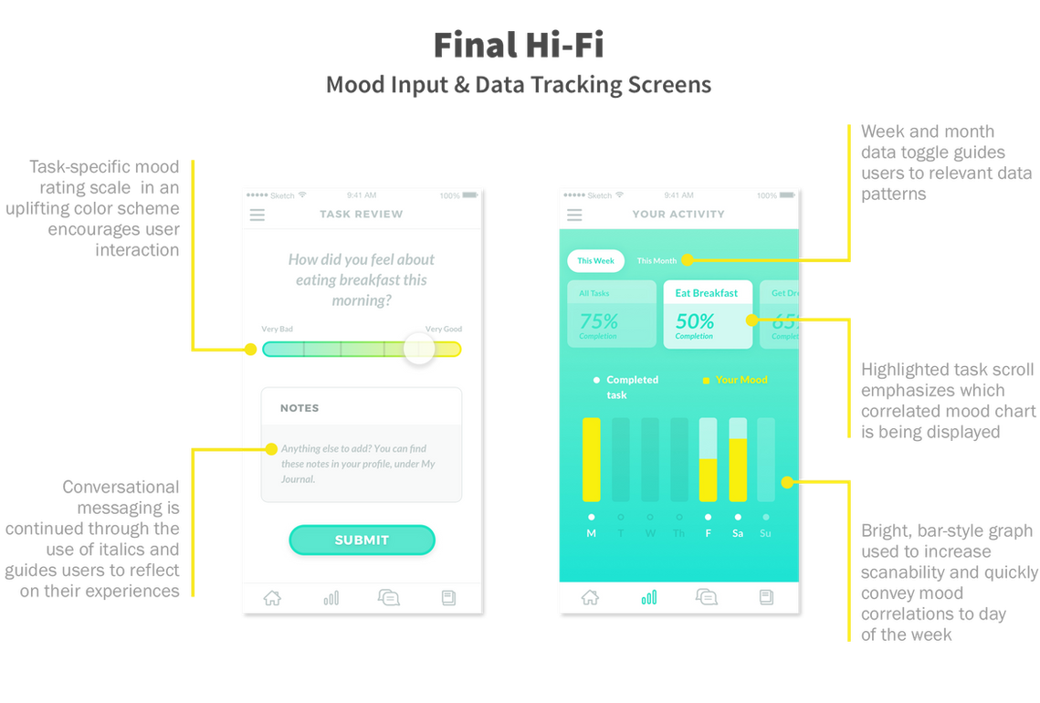
2) Mood tracking input & data visualization
3) Accountability & notification flows
4) Ability to connect with buddies in-app
5) Geofencing capabilities & automatic task confirmation
6) Gamification without punitive measures
Information about the emotional state of our main users heavily guided how we approached feature design and UX flows. Since anxiety levels in users is already high, triggering further anxiety by presenting too much information, providing punitive feedback, or having unclear next actions needs to be avoided.

Rough UI sketches of the geolocation interface

Rough UI sketches for geolocation & messaging screens
Lo-Fi Iterations
Initial Lo-Fi designs explored traditional list-style task management that mitigated information overload through day-view and hidden settings.
After validation testing several versions of a Lo-Fi clickable prototype, strong points of the UX became solidified and we aimed to carry these themes through most of the app:
1) Nested or hidden functionality wherever possible
2) Automated check-in for location-based tasks
3) Data visualization & collection that is useful for all 3 user types
Below are example Lo-Fi iterations of our main user homepage, which is their daily task view.


Designing A Supportive Brand Experience
The next step after solidifying UX flows and primary app functionalities was to dive straight in to the feel of the app. The atmosphere to be created in Hi-Fi will function as a main determinant of how users perceive the app.
Following a multi-hour branding workshop with the company's leadership team, style tiles were created to provide options for brand direction. The chosen color palettes evoke grounded, tranquil, or energizing experiences. The typefaces selected are all sans serif with higher than average x-heights and open, rounded counters. This achieves a modern, approachable look and adds a friendly personality to the interface.

Sampling of style tiles created from branding workshop findings & creative brief development
Plant graphics were created for the app home screen to track progress, and their style needed to generate a mood of inspiration and liveliness. Since the plants "grow" in response to task completion, they were designed with a flat, bright color scheme to inspire light-heartedness and further the app's messaging of support and forward progress.

Branding workshop synthesis

Sample plant graphics created for progress tracking on the app home screen
Creating Mood with Hi-Fi
The primary goals of Hi-Fi were to create a product that feels light, approachable, and clearly guides users toward what to do next. Balancing these three things could help address a serious mental health issue in a way that buffers the gravity of the situation and reduces user overwhelm.
To achieve this feel, some basic approaches were taken to design components:
1) Hairline strokes
2) Rounded corners
3) Lots of white space
4) Splashes of bright color
5) Gray text for softer impact
6) Open icons
Hi-Fi was validation tested using a clickable prototype.
Continued testing of current designs with target demographics & creating additional flows for backlog app features are two of the top priorities going forward for Atlas.


Additional Hi-Fi screens
Reflections
This project offered a lot of challenges from the wide scope to the depth of knowledge required to really grasp the founder's vision for the app.
Learning how to quickly parse what is valuable for a minimum viable project was a key skill I gained during this project, and helped me to internalize project approach from a business perspective.
Additionally, the condensed research time frame forced a lot of creative teamwork to figure out how to find groups of people that could provide usable analogous research. I will certainly take this mindset forward with me when approaching new design projects and working out how to best gather data.